Data Visualization
Super Bowl Commercials 2000 - 2021
Goal
This is a visualization project made in Excel. The challenge is to take on the role of a marketing analyst for a car manufacturer looking to make a splash in the market and wants to run a TV commercial during the 2022 Super Bowl.
The goal is to find patterns and insights through data visualization by analyzing the Super Bowl commercials for the last 21 years.
Data set
The data can be found in the data playground of Maven Analytics here. The data set contains Super Bowl commercials for ten popular brands from 2000 to 2021, including links to each and additional information about the length, estimated cost, YouTube statistics, TV viewers, and defining characteristics. (Download the Excel File for more details)
Approaching
The data manipulation and data visualization were made in Excel. The following are some steps applied to the data:
- To replace TRUE/FALSE by 1/0 in the characteristics of the commercial (Funny, Show Product Quickly, Patriotic, Celebrity, Danger, Animal, Uses Sex)
- To calculate the ratio of the Cost of Commercial versus the number of views on Youtube
- To calculate the ratio of the Cost of Commercial versus the number of likes on Youtube
- To calculate the ratio of the Cost of Commercials versus the number of TV viewers
Analysis
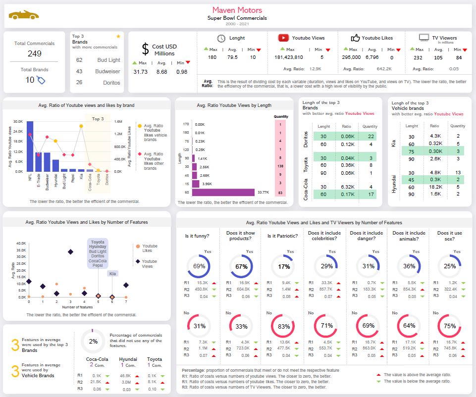
The head of the dashboard is a set of cards that helps to have a general idea about the variables in the data set. For instance, it is easy and fast to determine the number of commercials analyzed, the brands who participated, and the maximum, minimum and average in some variables like cost, length, youtube views, likes and TV viewers.
From here, the word “ratio” start to appear. It means the proportion of each variable about the cost of the commercial. Why is this useful for? Primarily because it helps identify the efficiency of the commercial, or in other words, which commercials generated more likes and views at a low cost.
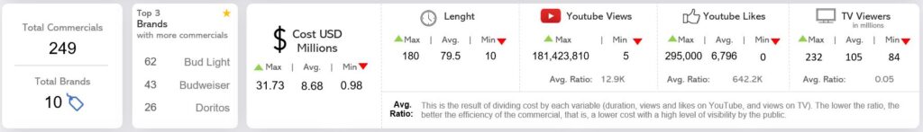
On the right side, it is possible to observe the ratio of youtube views and likes Or which brand with lower cost generates high volumes of views.
According to the output, Coca-Cola, Toyota, and Doritos are the three brands with higher views and low costs. As the challenge of this project is to help a car manufacturer identify the best approach to the next super bowl, the idea is also to determine how the competitors have been done, so Toyota starts to appear as a referent for our analysis.
About Kia, we can conclude that even though they have a low ratio of youtube views, the proportion of youtube likes is too high, meaning that the commercials are not hooking the users.
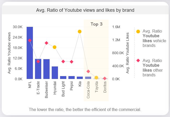
The best ratio (cost versus views on YouTube) according to the duration of the commercials is 170 and 180 seconds. However, for each of these durations, only one commercial was reported, so it cannot be generalized with this result. Therefore, it is recommended to generate videos of 30 seconds with an acceptable rate ratio, and two of the three brands in the top 3 have good records with videos of this length.
It looks like when brands use five or six features in their commercials, they generate a good ratio of youtube views and likes. The three car manufacturers have a good score using this number of features.
When the commercials use three features, they generate a good ratio for youtube likes but a high ratio for youtube views.
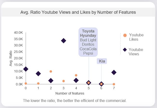
So it is clear that using five or six features generates a good result for the brands, including the car manufacturers. But what kind of features it the ideal? The following graph helps in answering this question.
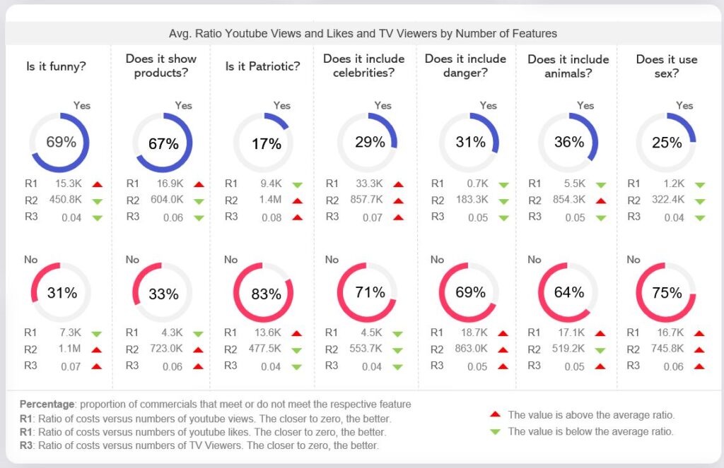
The percentage inside the blue donut chart represents the commercials that include that feature. The portion inside the red donut chart represents the proportion of commercials that do not have that feature.
The green arrow represents when the value reported is below the average, and the red represents when the declared value is above the norm.
R1 is for comparing the cost versus youtube views, R2 is the cost versus youtube likes, and R3 is the cost versus TV Viewers.
With the above declaration and analyzing the donuts, it can be concluded that the most attractive feature for the public is the scenes of danger and the use of sex (all ratios are below the average).
Although the rate of views is not the best, the rate of likes on YouTube is favourable for funny commercials and those that show the product.
On the other hand, the ratios for commercials where a celebrity was in it have high numbers, meaning that kinds of commercials are more expensive than the impact they generate on people.
Finally, Maven Motor must be careful with using animals in commercials; the number of people who liked this commercial on YouTube generated a high value. (in other words, they don’t like that kind of commercial)